Metropolitan Opera Rebrand
The project consisted of re-designing the visual identity of the Metropolitan Opera House in New York City.
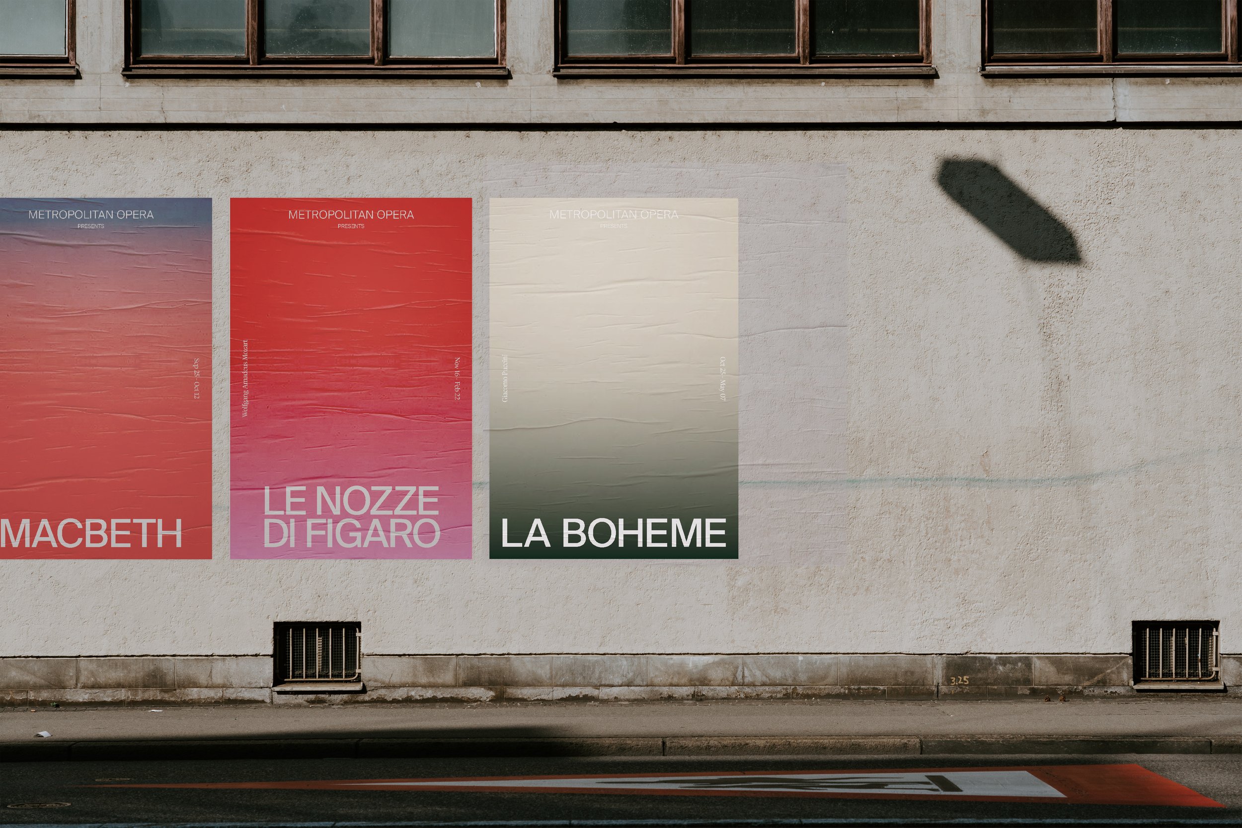
The whole idea behind this re-design was to create a new look that is bold, graphic and the opposite of what you would expect an Opera House branding to look like.
The previous design was beautifully designed, but it was classic, elegant and very archetypal of the opera. I wanted to deviate from that style and create something unexpected and modern to attract a younger audience. Not to mention, the previous identity consisted of many elements including type, illustrations and photographs, I wanted to challenge myself and design a system that tells a story using only one element: color.

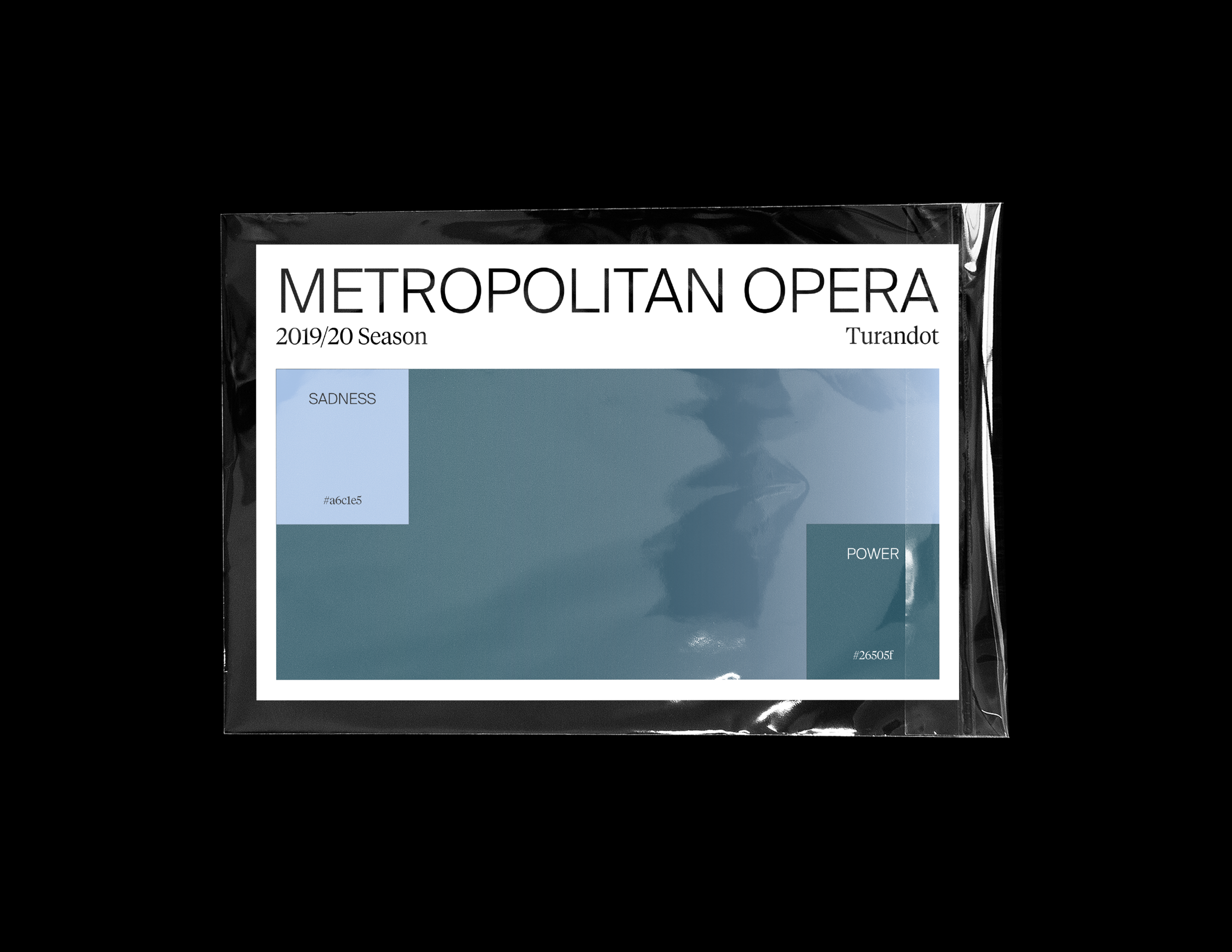
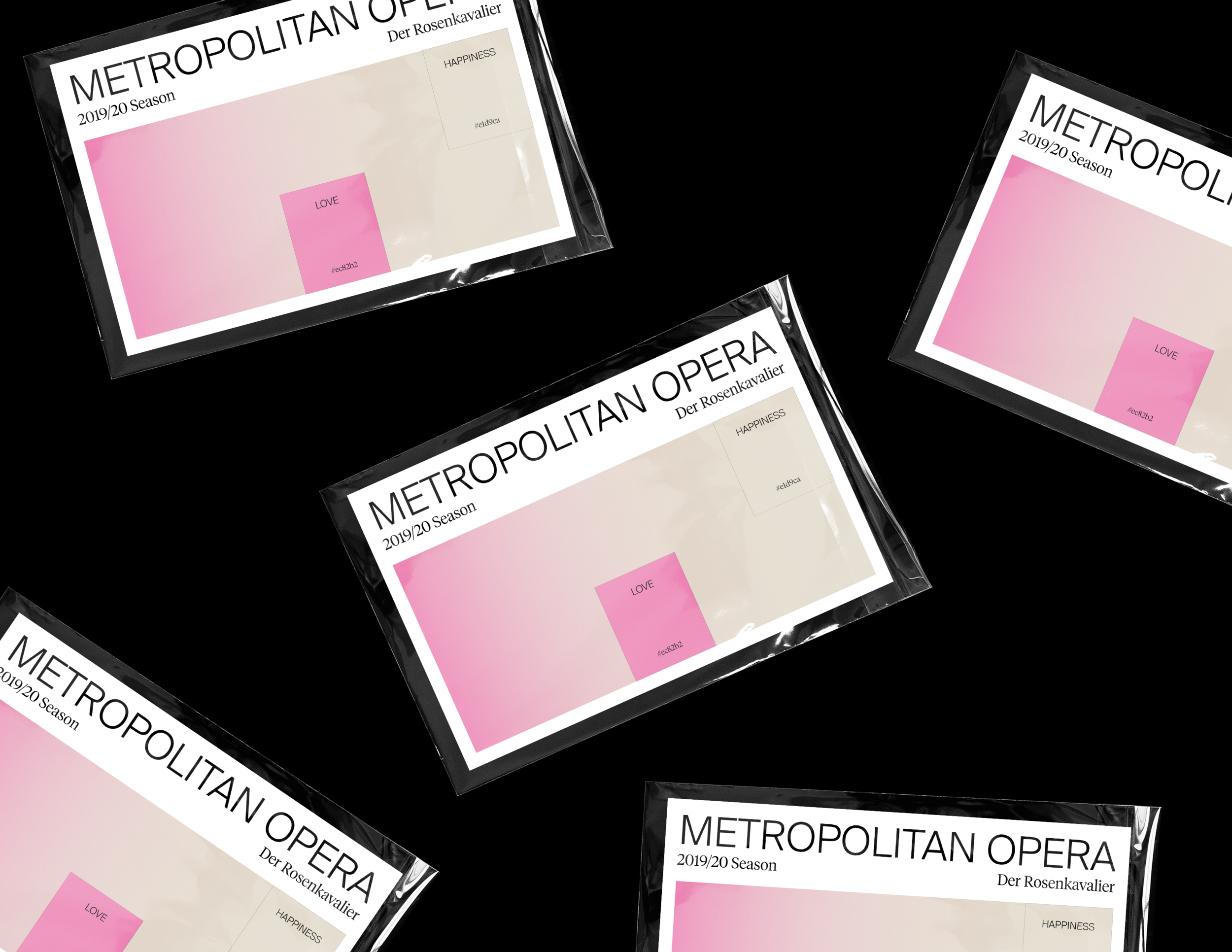
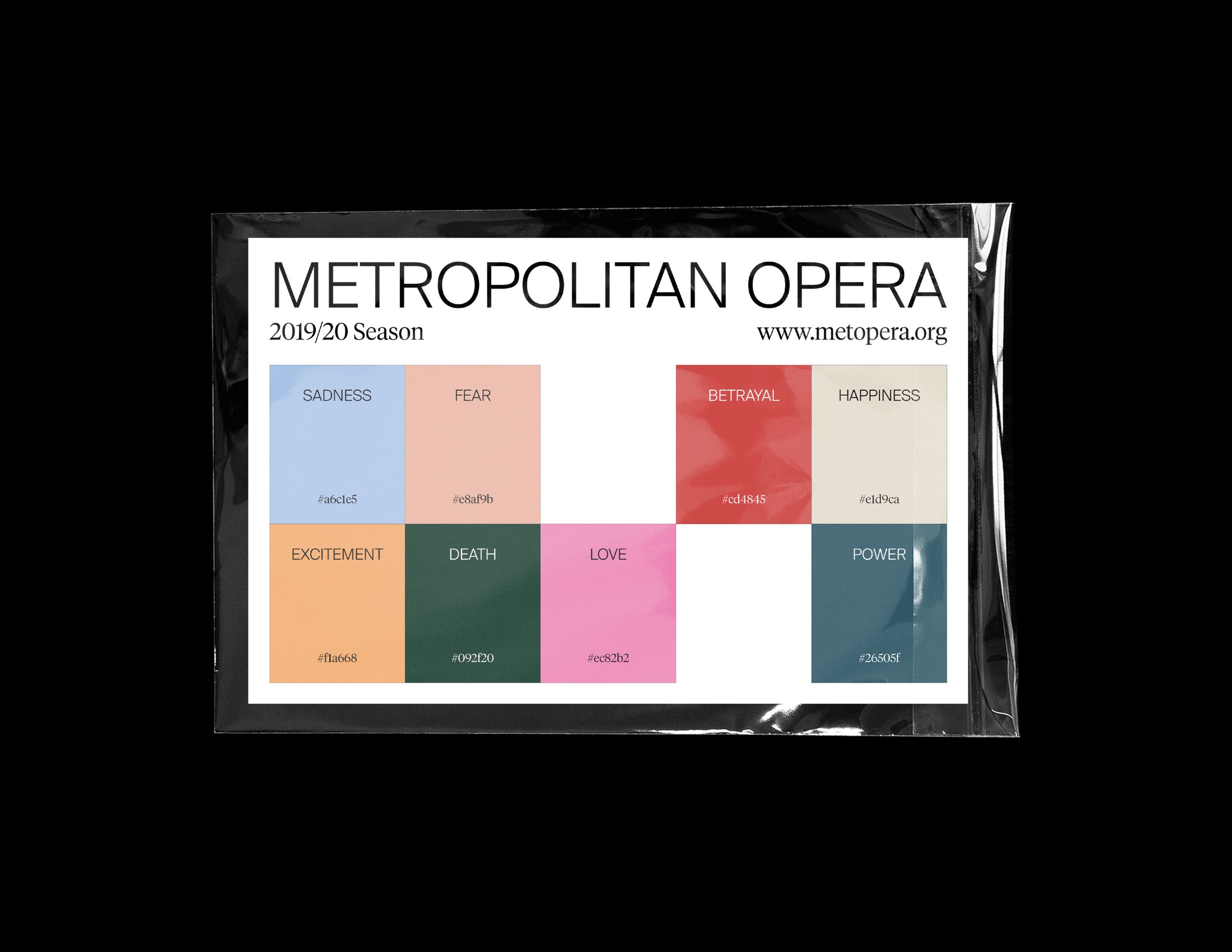
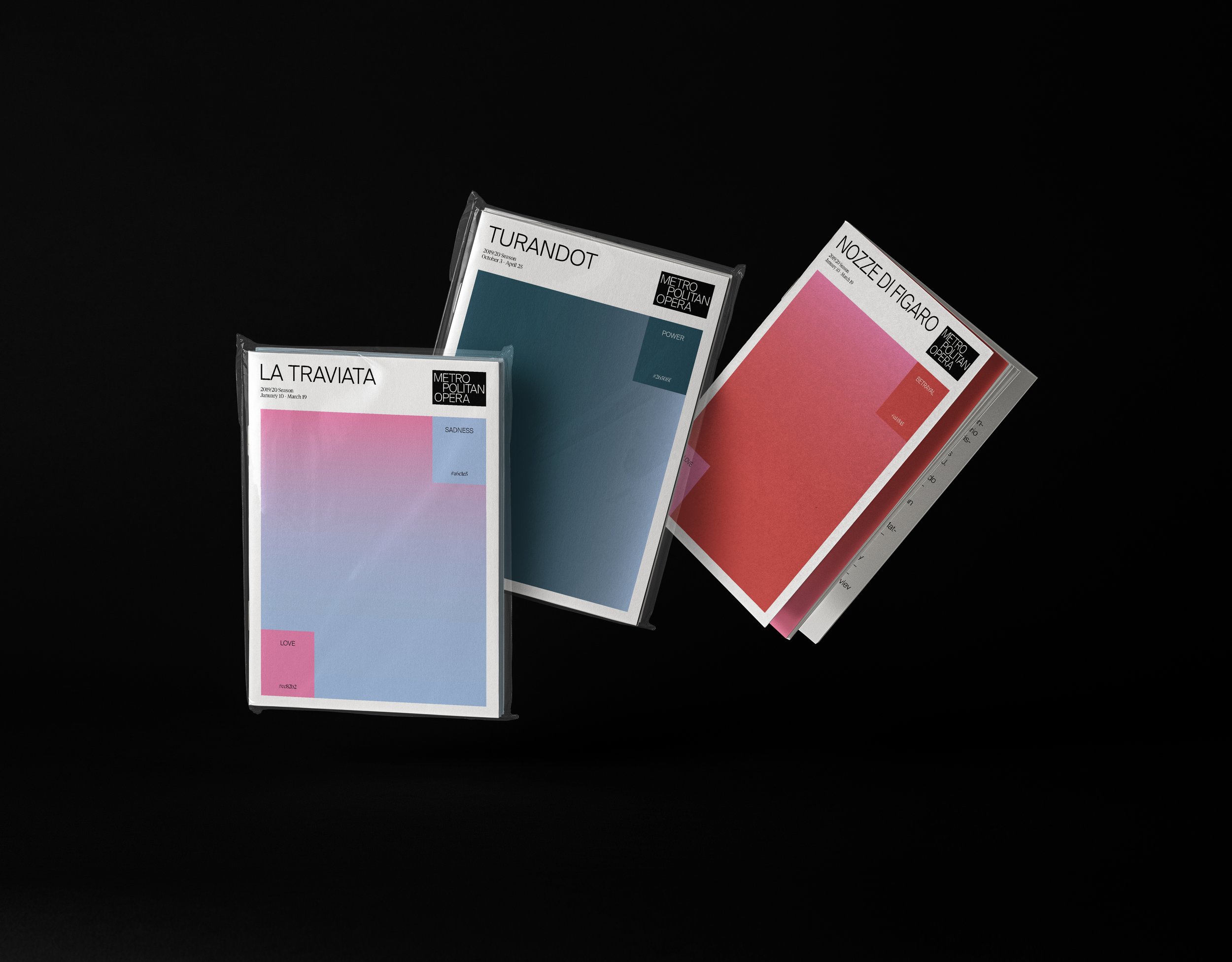
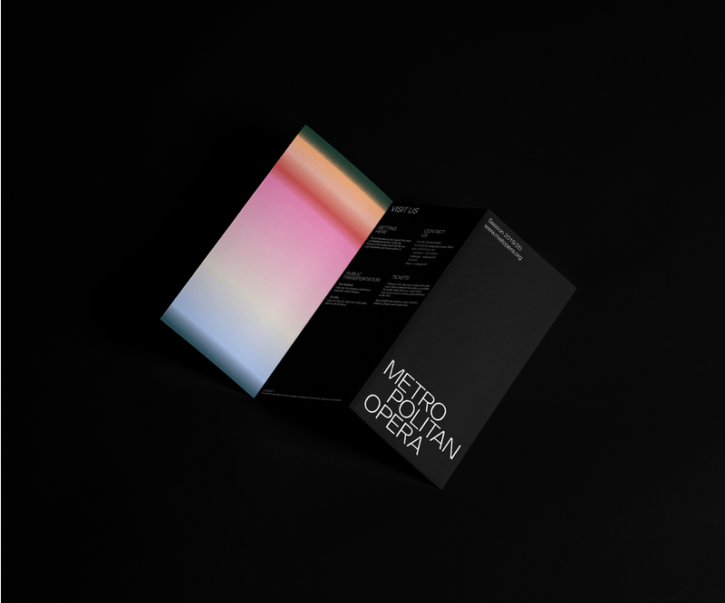
Color = Emotion
For the visual identity's color palette, we decided to create a story using only color and typography, no images. Therefore, we created a system of 8 colors that match 8 emotions, and depending on the each opera's synopsis, two colors were selected for every play. The end result is a series of gradients designed specifically for each opera that showcases at the Met Opera.